Is Your Small Business Website Mobile-Friendly? A 10-Minute Check
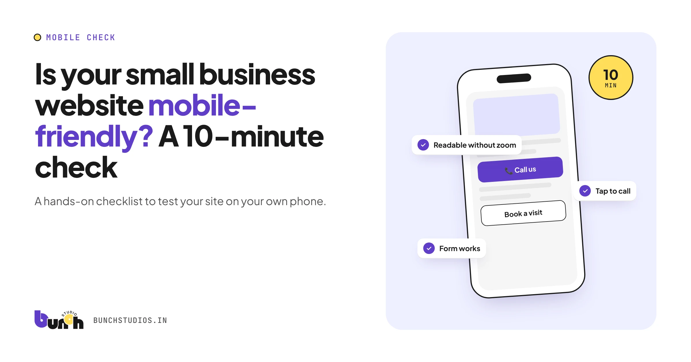
A mobile-friendly website is one people can read, navigate and act on comfortably on a phone, without zooming, pinching or hunting for the contact button. It matters for two reasons: many of your visitors may see your site on a phone first, and Google uses the mobile version of your site's content for indexing and ranking (Google Search Central). If something is missing or broken on your mobile site, that's what Google sees. The checklist below takes about ten minutes with your own phone.
What "mobile-friendly" actually means
It's more than "it shrinks to fit." A mobile-friendly small business site:
- shows the same content on a phone as on a computer, just arranged differently
- has text you can read without zooming
- has buttons and links you can tap without hitting the wrong one
- makes calling, booking or contacting you easy with a thumb
- loads quickly on a phone connection
Google recommends responsive design, where the same page adapts to any screen size, as the easiest approach to build and maintain (Google Search Central).
The 10-minute phone check
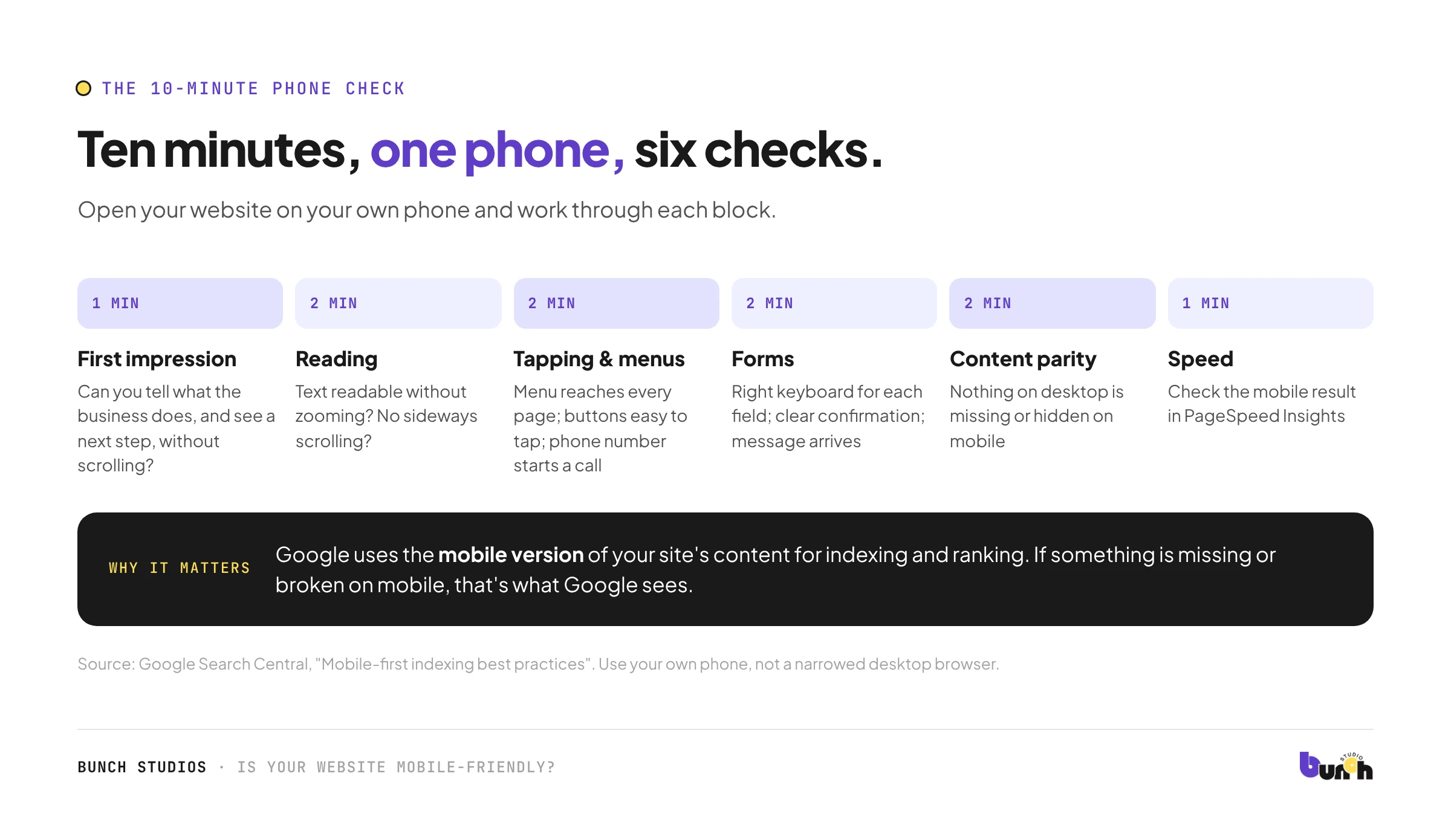
Open your website on your own phone (not a desktop browser made narrow) and work through this list. If you can, repeat it on a second phone, ideally a different brand or an older model.
First impression (1 minute)
- Can you tell what the business does without scrolling?
- Is there an obvious next step (call, book, request a quote) near the top?
- Does a pop-up cover the page before you can read anything? Google advises using banners that take up only a small part of the screen instead (Google Search Central).
Reading (2 minutes)
- Is body text readable without zooming?
- Do you ever have to scroll sideways to read a sentence?
- Do headings make it easy to skim?
Tapping and navigating (2 minutes)
- Can you open the menu and reach every main page?
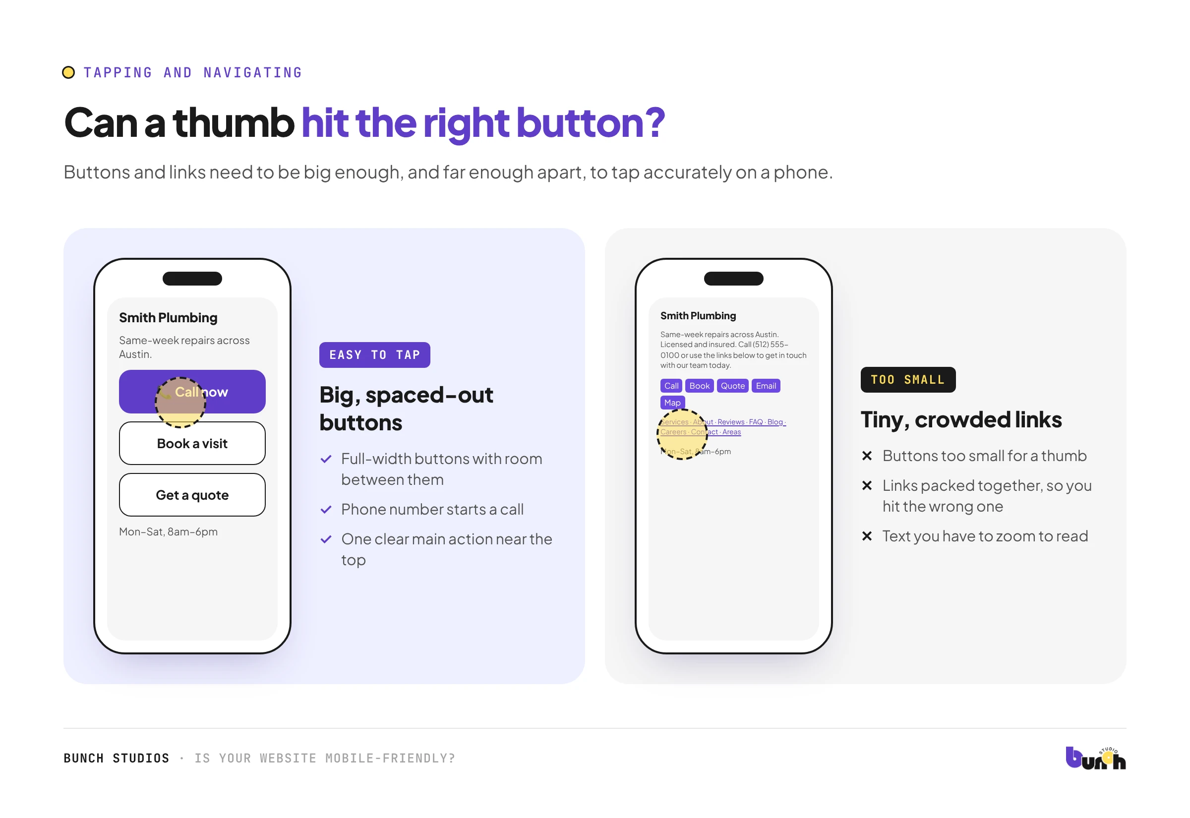
- Are buttons and links big enough and far enough apart to tap accurately?
- Does your phone number start a call when tapped?
- Does your address open in a maps app?
Forms (2 minutes)
- Fill in your contact form on the phone. Is it easy?
- Do fields bring up the right keyboard (numbers for phone, email keyboard for email)?
- After submitting, do you see a clear confirmation, and does the message reach your inbox?
Content parity (2 minutes)
- Is anything that appears on desktop missing on mobile? Google indexes the mobile version, so missing content may not count.
- Are important details only revealed after a tap or swipe? Google says it won't load content that needs a user interaction to appear, so make sure key information is in the page itself.
Speed (1 minute)
- Run your homepage through Google's free PageSpeed Insights and look at the mobile results.
- Are images huge files? That's usually the first thing to fix.
Which tools to use now
You may find old advice telling you to use Google's Mobile-Friendly Test. Google retired that tool in December 2023 (Google Search Central). Today, the most useful checks are your own phone, PageSpeed Insights for speed, and a friend who has never used your site trying to contact you.
Common fixes, from easiest to biggest
| Problem | Usual fix |
|---|---|
| Phone number not tappable | Make it a click-to-call link |
| Text too small | Increase the base font size |
| Buttons too close together | Increase button size and spacing |
| Slow pages | Compress and correctly size images |
| Pop-up blocks the page | Make it a small banner, delay it, or remove it |
| Content missing on mobile | Show the same content, using expandable sections to save space |
| Layout breaks on phones | The build isn't responsive: usually a redesign |
If your site fails several checks in the last category, you're looking at a redesign rather than a few fixes. Our redesign cost guide explains what that involves. Mobile problems often overlap with accessibility, so it's worth running our accessibility checklist too. If your site passes but still gets few enquiries, see why websites get visitors but few enquiries.
How Bunch Studios builds for phones
We design every page for phones and desktops from the start, not as an afterthought, and we test on real devices before launch. If you're not sure whether your current site needs fixes or a redesign, we'll review it first and tell you plainly.
Request a Scoped EstimateHow we made this guide: researched and drafted with AI assistance and checked against the Google sources linked above.
Sources: Google Search Central, Mobile-first indexing best practices; Google Search Central, Avoid intrusive interstitials and dialogs; Google Search Central blog, Mobile-Friendly Test (retired); PageSpeed Insights. All checked Oct 13, 2026.