Website Accessibility Basics Every Small Business Should Check
An accessible website is one that people with disabilities can use: people who are blind and use screen readers, people who can't use a mouse, people with low vision who zoom in, and people who need captions. The international standard is the Web Content Accessibility Guidelines (WCAG) from the W3C, with testable criteria at three levels: A, AA and AAA (W3C). You don't need to be technical to spot the most common problems. The checklist below follows the W3C's own "Easy Checks," which it describes as a first review rather than a full evaluation (W3C).
This article is practical guidance, not legal advice.
Why it's worth doing
- More people can use your site, including customers with permanent disabilities, older visitors, and anyone with a temporary injury or a phone in bright sun.
- Many fixes help everyone. Clear headings, readable contrast and labeled forms make a site easier for all visitors.
- It's cheaper to build in than bolt on. Asking for accessibility at the start of a project costs less than fixing it later. See our website cost guide.
Which level should you aim for?
The checklist
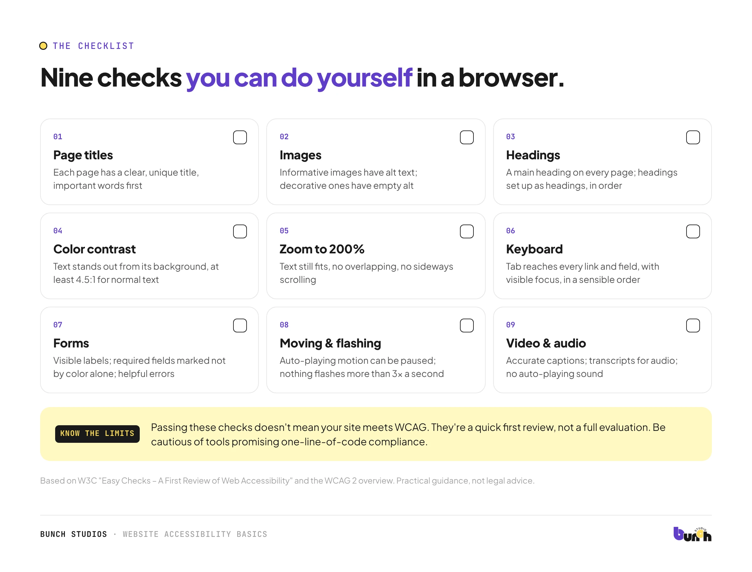
1. Page titles
- Each page has a title (shown in the browser tab) that says what the page is.
- Titles differ from page to page, with the important words first: "Services: Smith Plumbing" beats "Smith Plumbing | Services."
2. Images
- Images that carry information have alt text saying what they show or do.
- Purely decorative images have empty alt text, so screen readers skip them.
- Buttons and logos made of images have alt text matching their function: a search button's alt text should say "Search," not "magnifying glass."
3. Headings
- Every page has a main heading.
- Text that looks like a heading is set up as a heading, not just bold text.
- Headings follow a sensible order.
4. Color contrast
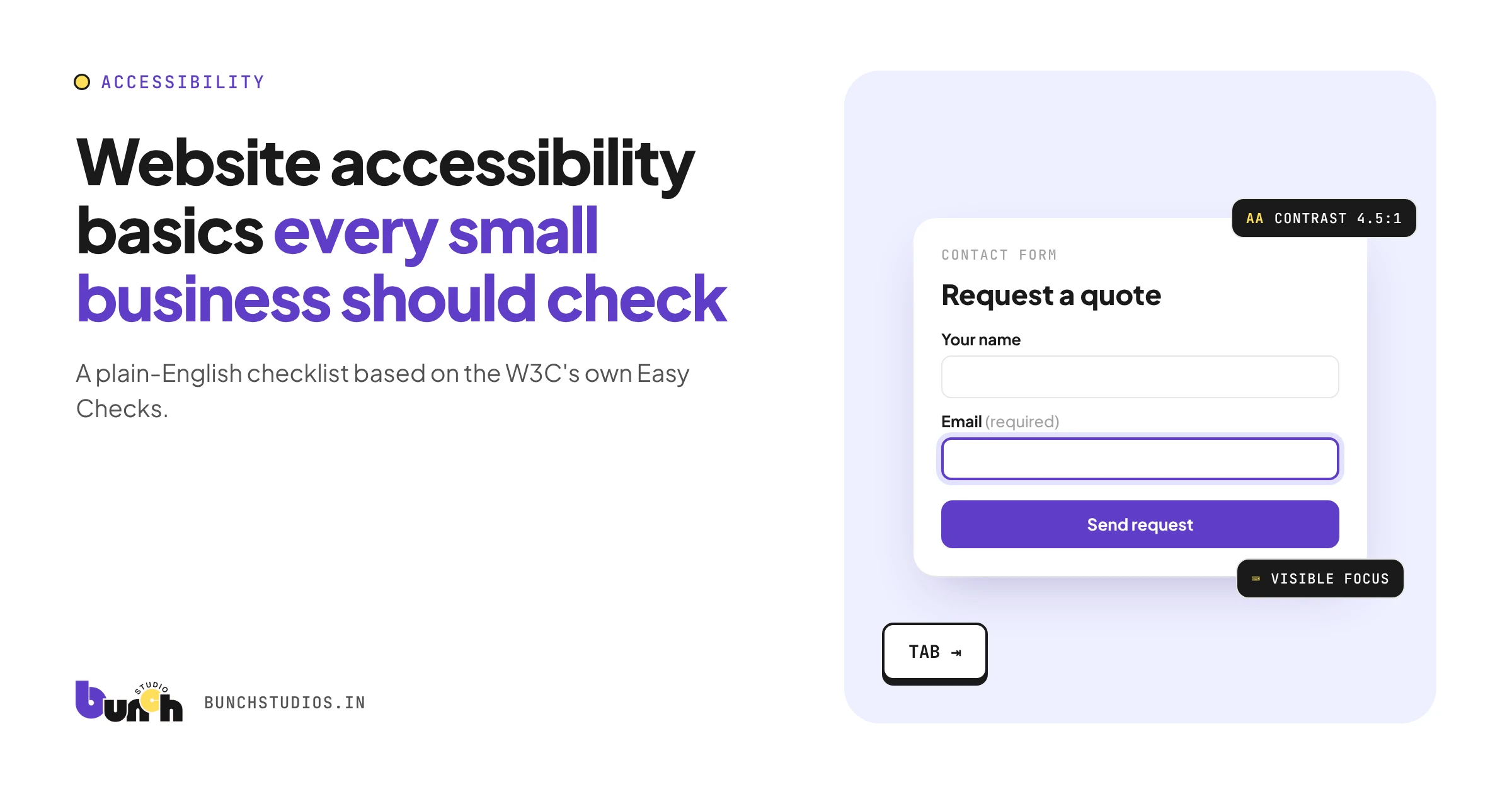
- Text stands out clearly from its background. W3C's check uses a minimum contrast ratio of 4.5:1 for normal-size text (W3C). Free contrast checkers can measure this.
- Information isn't shown by color alone ("required fields are in red").
5. Zoom and text size
- Zoom your browser to 200%. Text still fits, doesn't overlap, and doesn't need sideways scrolling.
- Important text isn't baked into images.
6. Keyboard
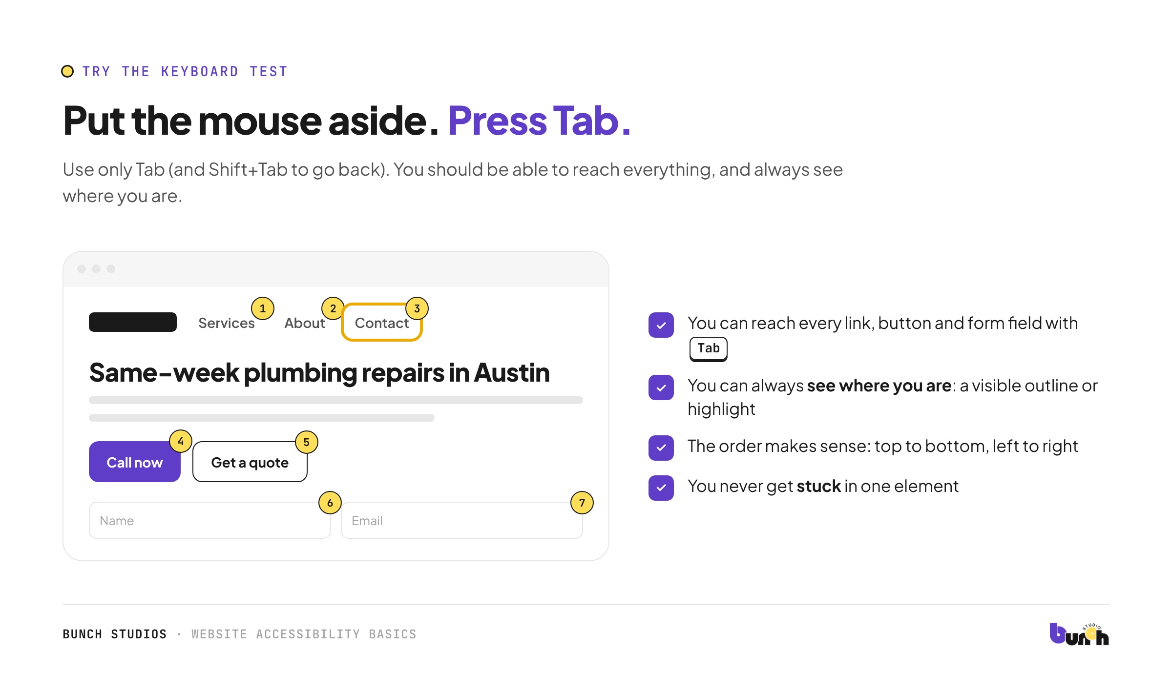
Put your mouse aside and use only the Tab key (Shift+Tab goes back).
- You can reach every link, button and form field.
- You can always see where you are (a visible outline or highlight).
- The order makes sense, and you never get stuck.
7. Forms
- Every field has a visible label.
- Required fields are marked, and not by color alone.
- Error messages say what's wrong and how to fix it, and your other answers are kept.
8. Links
- Link text says where it goes: "See our pricing" rather than "click here."
9. Moving and flashing content
- Sliders or animations that start on their own can be paused.
- Nothing flashes more than three times a second.
10. Video and audio
- Videos have accurate captions (automatic captions alone usually aren't enough).
- Audio-only content has a transcript.
What to fix first
Start with the pages and tasks that matter most: your homepage, main service pages and contact form. Fix anything that stops someone completing a task (a form that can't be used by keyboard, an unlabeled field, unreadable text) before cosmetic issues.
What this checklist doesn't do
Passing these checks doesn't mean your site meets WCAG. The W3C is explicit that a page can pass its Easy Checks and still have significant barriers (W3C). A full picture needs an evaluation against WCAG and, ideally, testing with people who use assistive technology.
Be cautious of tools that promise compliance from one line of code. Fixing the site itself (content, structure and code) is what makes it usable.
What to ask a website provider
- Which WCAG version and level will you design and build to?
- How will you test it: automated tools, keyboard testing, screen reader checks?
- Will my CMS help me add alt text and headings correctly when I edit pages?
How Bunch Studios approaches accessibility
We plan headings, contrast, labeled forms, alt text and keyboard use into the design and build rather than patching them afterwards. Ask us which level and testing your scoped estimate covers; it will be written down.
Request a Scoped EstimateHow we made this guide: researched and drafted with AI assistance and checked against the W3C and CT.gov sources linked above. Not legal advice.
Sources: W3C WAI, WCAG 2 Overview; W3C WAI, Easy Checks – A First Review of Web Accessibility; State of Connecticut, Top 10 Website Accessibility Tasks Checklist. All checked Oct 13, 2026.