Why Startup Websites Fail to Explain the Product Clearly

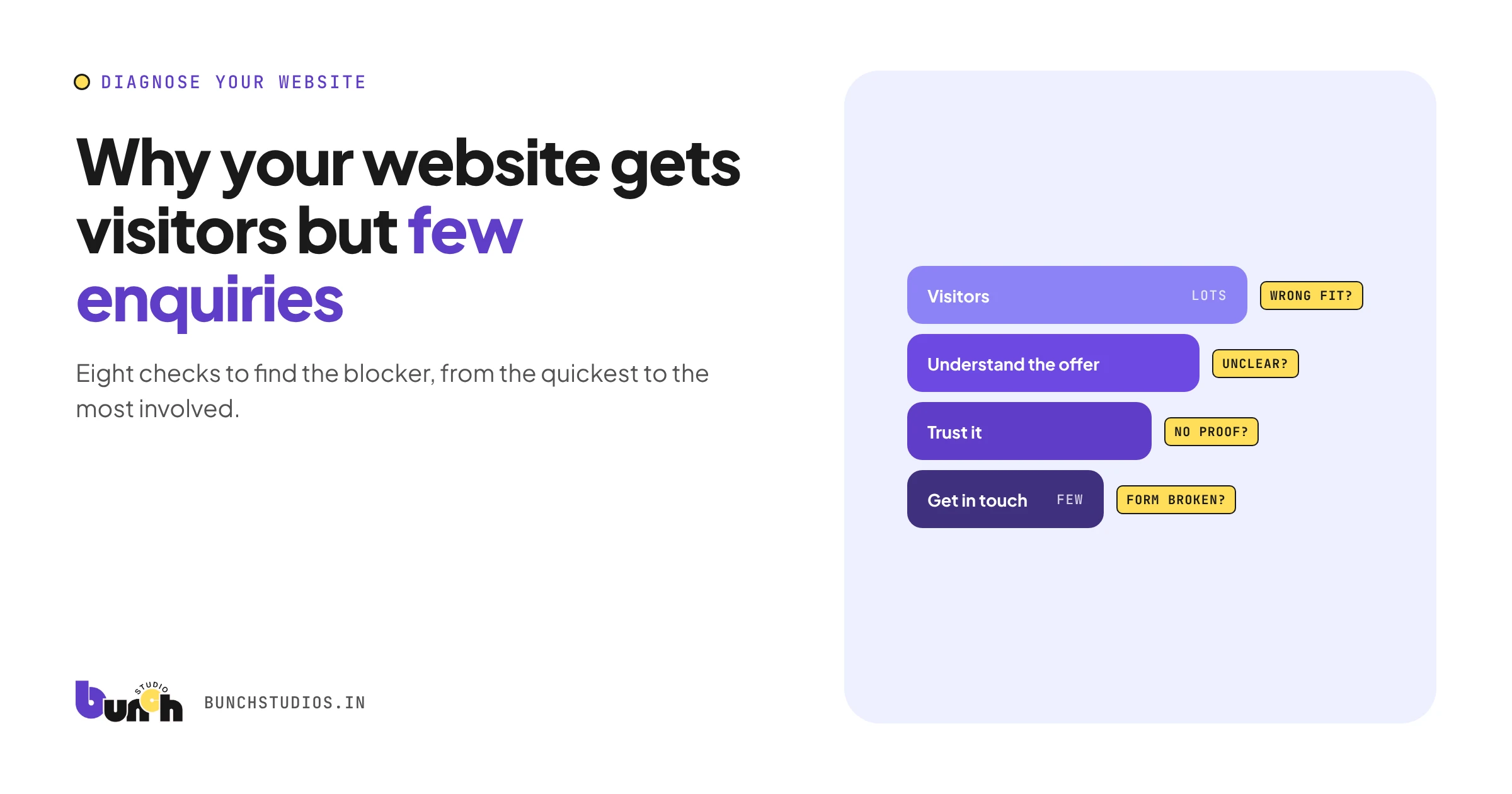
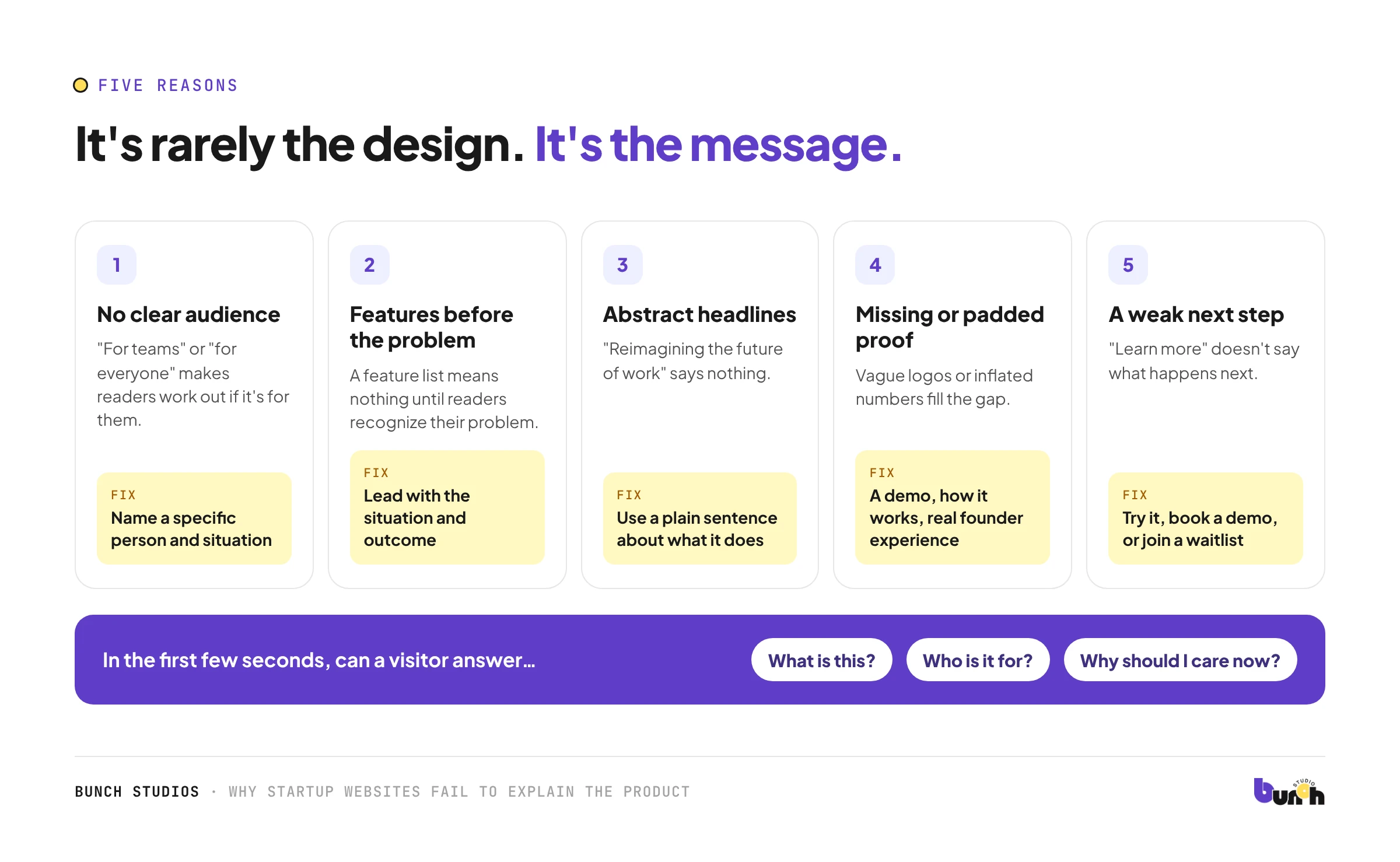
Most early-stage startup websites don't fail because of design. They fail because a visitor can't answer three questions in the first few seconds: What is this? Who is it for? Why should I care now? The usual causes are describing the product in features instead of outcomes, trying to speak to everyone, borrowing big-company language, and ending with a vague "learn more." The fix starts with a one-page message, not a new website.
Five reasons startup sites confuse people
1. No clear audience
"For teams," "for businesses" and "for everyone" make the reader do the work of figuring out if it's for them. Name a specific person and situation, such as "for two-person bookkeeping firms juggling client documents by email."
2. Features before the problem
A list of features means nothing until the reader recognizes their problem. Lead with the situation and the outcome; features come after, as proof that you can deliver it.
3. Abstract headlines
"Reimagining the future of work" sounds impressive and says nothing. A plain sentence describing what the product does usually wins. If a stranger could swap your headline onto a competitor's site without anyone noticing, it isn't specific enough.
4. Proof that isn't there yet, or is padded
Early startups often have little proof, and some fill the gap with vague logos or inflated numbers. Honest substitutes work better: a clear demo, a specific description of how it works, the founders' relevant experience, or "currently in pilot with X types of teams" if that's true.
5. A weak next step
"Learn more" and "Contact us" don't tell visitors what happens next. Match the action to how ready they are: try it, book a demo, join a waitlist. Then say what happens after they click.
The one-page messaging fix
Write these before redesigning anything:
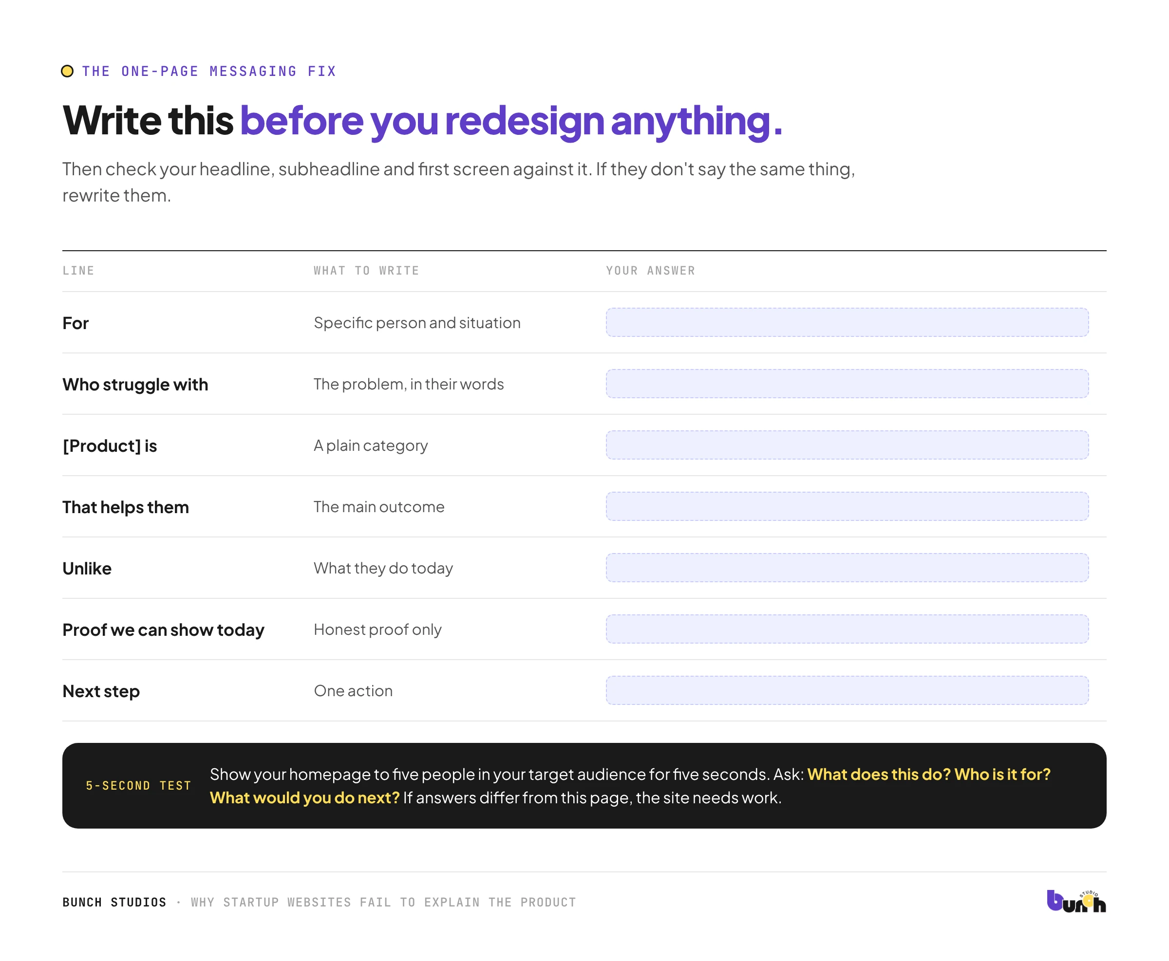
| Line | What to write | Your answer |
|---|---|---|
| For | Specific person and situation | |
| Who struggle with | The problem, in their words | |
| [Product] is | A plain category | |
| That helps them | The main outcome | |
| Unlike | What they do today | |
| Proof we can show today | Honest proof only | |
| Next step | One action |
Then check your homepage headline, subheadline and first screen against it. If they don't say the same thing, rewrite them.
A before and after (hypothetical)
Hypothetical example for illustration only.
Before: "The intelligent platform for modern workflows."
After: "Collect client documents in one link instead of 40 emails. Built for small accounting firms."
The second version names the audience, the problem and the outcome in two short sentences. Nothing about it requires a redesign.
A quick test
Show your homepage to five people in your target audience for five seconds, then ask: What does this do? Who is it for? What would you do next? If their answers differ from your messaging page, the site needs work. If they match but people still don't act, look at proof and the next step.
Where the words come from
The best messaging usually comes from customers, not from a brainstorm. Read your early users' emails, sales-call notes and support questions, and look for the phrases they use to describe the problem. Those are the words that make the right people recognize themselves on your homepage. If you don't have users yet, talk to ten people who have the problem and write down exactly how they describe it. Their phrasing will almost always be plainer, and more convincing, than anything written in a pitch deck.
When it's time for help
If your message is clear on paper but the site still doesn't communicate it (layout, hierarchy, or a product that's hard to show), that's a design problem. Bunch Studios designs websites and product interfaces for very early, small startups as well as small businesses. We'll start with your message, not the visuals.
Discuss Your WebsiteHow we made this guide: drafted with AI assistance.