Why Users Find Some Digital Products Confusing
People usually find an app or web product confusing for a handful of reasons: it uses words they don't, its structure doesn't match how they think about the task, similar things behave differently in different places, it doesn't show what just happened, or it offers too many choices at once. None of these is about visual polish. Each one can be found by watching real people try to complete a task, and most can be fixed without rebuilding the product.
Signs your product has a confusion problem
- Support keeps answering the same "how do I…?" questions.
- Users ask for features that already exist.
- Many people drop out at the same step of a key flow.
- New customers need a call or a demo before they can get started.
- Your team explains the product by saying "it's easy once you know where things are."
If two or more of these sound familiar, the causes below are the place to look.
Six common causes
1. Your words, not theirs
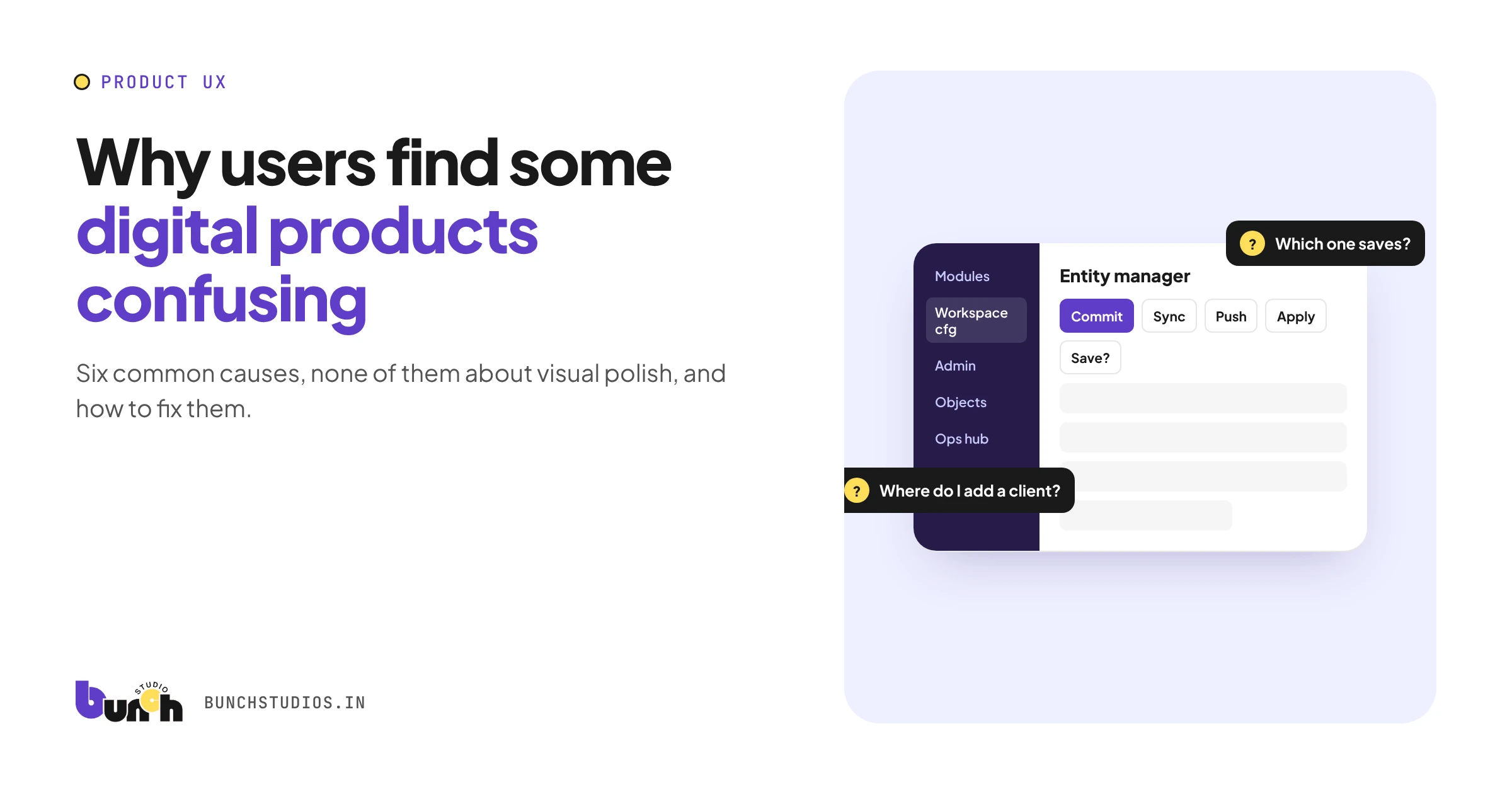
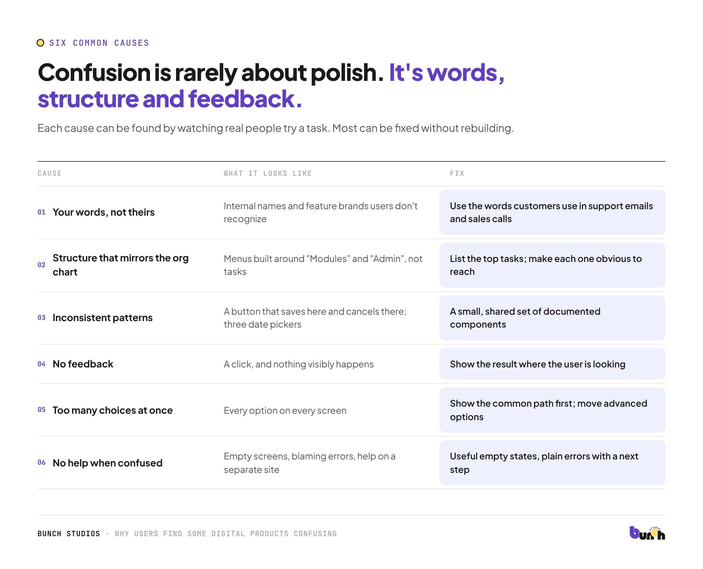
Internal names, feature brands and technical terms make sense to the team that built them. Users scan for words they already use. Fix: use the words customers use in support emails and sales calls, and test labels with users.
2. Structure that mirrors the org chart
Menus organized around how the company is built ("Modules," "Admin," "Workspace settings") rather than tasks ("Send an invoice," "Add a client"). Fix: list the top tasks and make each reachable in an obvious way.
3. Inconsistent patterns
A button that saves on one screen and cancels on another; three different date pickers; icons that mean different things in different places. Fix: a small, shared set of components and patterns, documented and reused.
4. No feedback
The user clicks and nothing visibly happens, or something happens somewhere they're not looking. Fix: always show the result of an action (saved, sent, error with how to fix it) where the user's attention is. Silence makes people click again, which can create duplicate orders or messages.
5. Too many choices at once
Every option visible on every screen. Fix: show the common path first, and move advanced options to a secondary place.
6. No help at the moment of confusion
Empty screens with no guidance, error messages that blame the user, help hidden in a separate site. Fix: useful empty states, plain error messages with a next step, and help in context.
Why teams don't see it
The people who build a product are the worst-placed to spot its confusing parts. They know where everything is, what every label means and why each screen exists. New users have none of that context. That's why confusion often survives for months: nobody on the team experiences it, and users rarely explain it. They just leave, or email support. Fresh eyes, from new customers, new hires or people outside the team, are the most reliable way to see the product as a first-time user does.
How to find the problems
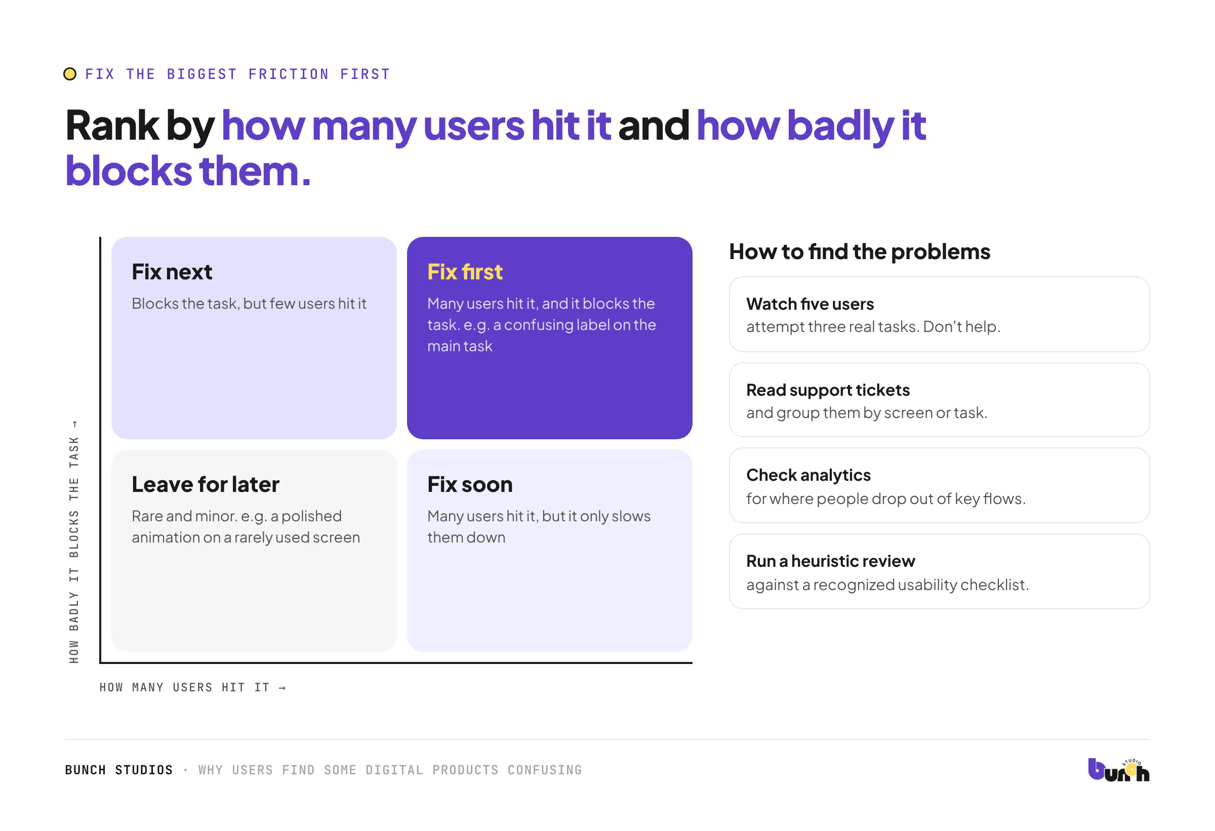
- Watch five users attempt three real tasks. Don't help. Note where they hesitate.
- Read support tickets and group them by screen or task.
- Check analytics for where people drop out of key flows.
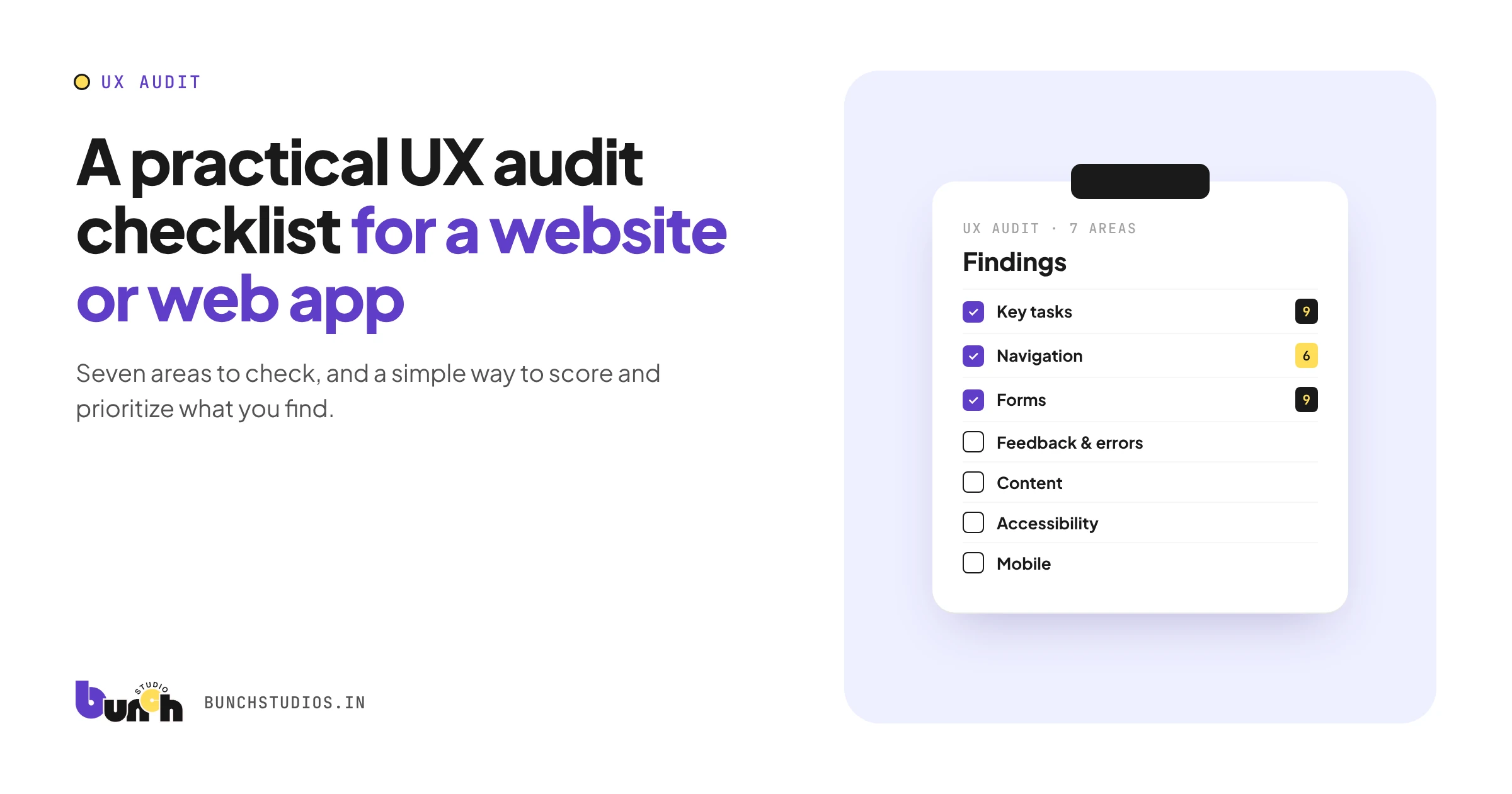
- Run a heuristic review with a recognized checklist, such as Jakob Nielsen's ten usability heuristics from the Nielsen Norman Group. Our UX audit checklist is a practical starting point.
Fix the biggest friction first
Rank problems by how many users hit them and how badly they block the task. A confusing label on the main task beats a polished animation on a rarely used screen. Then fix one thing, check it with a few users, and move on to the next. Keep a simple log of what you changed and what happened, so the team learns which kinds of fixes work for your users and doesn't reintroduce old problems later.
A quick example (hypothetical)
Hypothetical example for illustration only. A scheduling app's support inbox fills with "how do I reschedule?" emails. Watching three users shows the reschedule option sits under a menu labelled "Manage," next to "Cancel." Renaming it "Reschedule" and moving it beside the appointment time fixes most of the confusion without any new features.
How Bunch Studios helps
Bunch Studios' secondary practice is product, UI/UX and dashboard design for startups and small teams. We start by watching how people use the product, then fix the structure, language and patterns that cause confusion.
Discuss Your ProjectHow we made this guide: drafted with AI assistance.