A Practical UX Audit Checklist for a Website or Web App
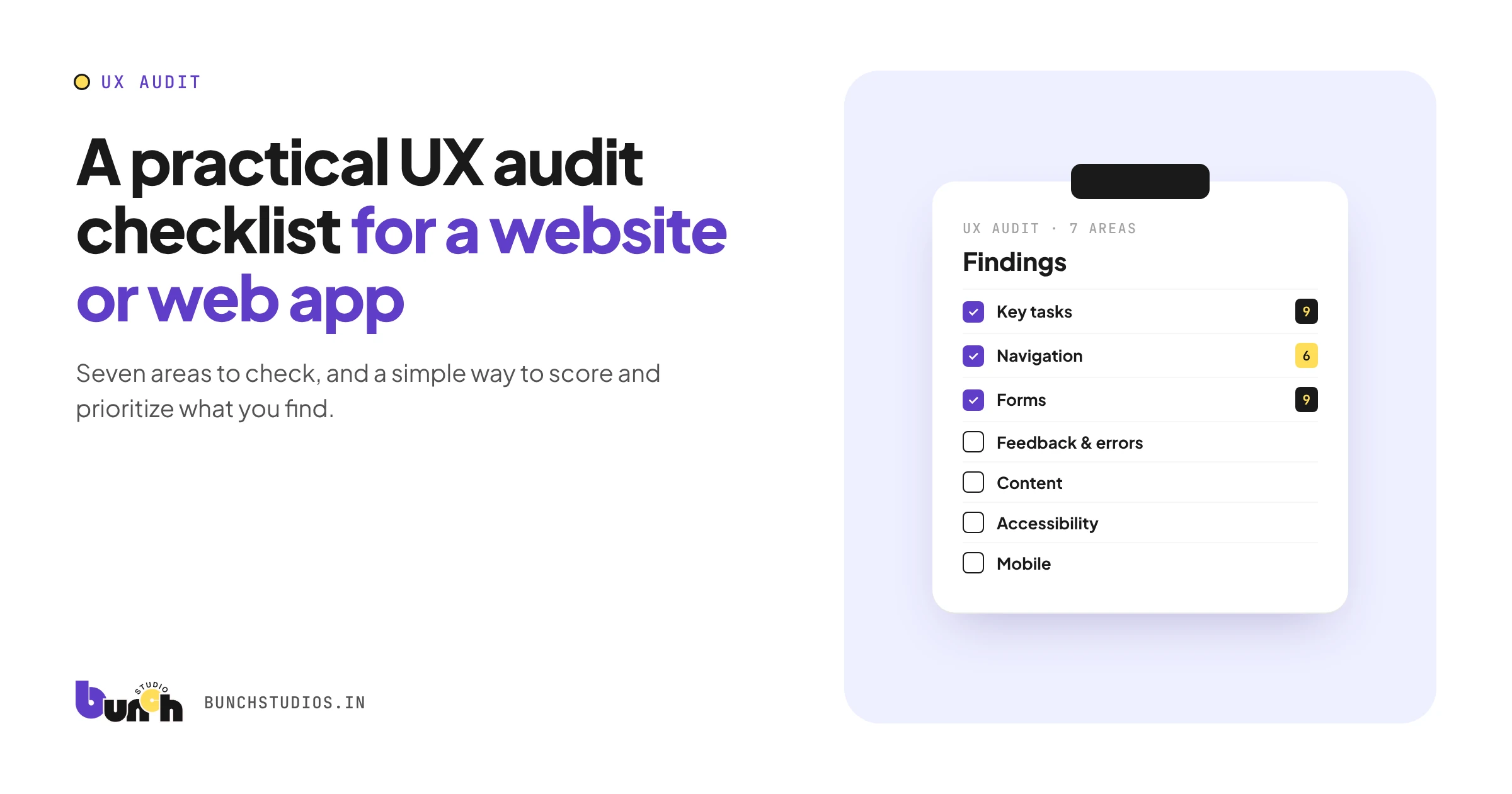
A UX audit is a structured review of how easy a website or app is to use, done by checking it against known usability principles and real tasks. A useful audit looks at seven areas: key tasks, navigation, forms, feedback and errors, content, accessibility, and mobile. Then it scores each problem by how badly it blocks users and how often they hit it. The checklist below is a practical starting point. It doesn't replace watching real users, but it reliably finds the obvious problems first.
Before you start
- Pick three to five key tasks (for example: sign up, book, find pricing, complete a purchase, contact support).
- Decide the devices: at least one phone and one desktop browser.
- Gather data if you have it: analytics drop-off points, support tickets, recordings.
- Use a fresh account, so you see what a new user sees rather than your saved settings.
- Write down each task's starting point and goal, so every reviewer tests the same thing and results can be compared next time.
The checklist
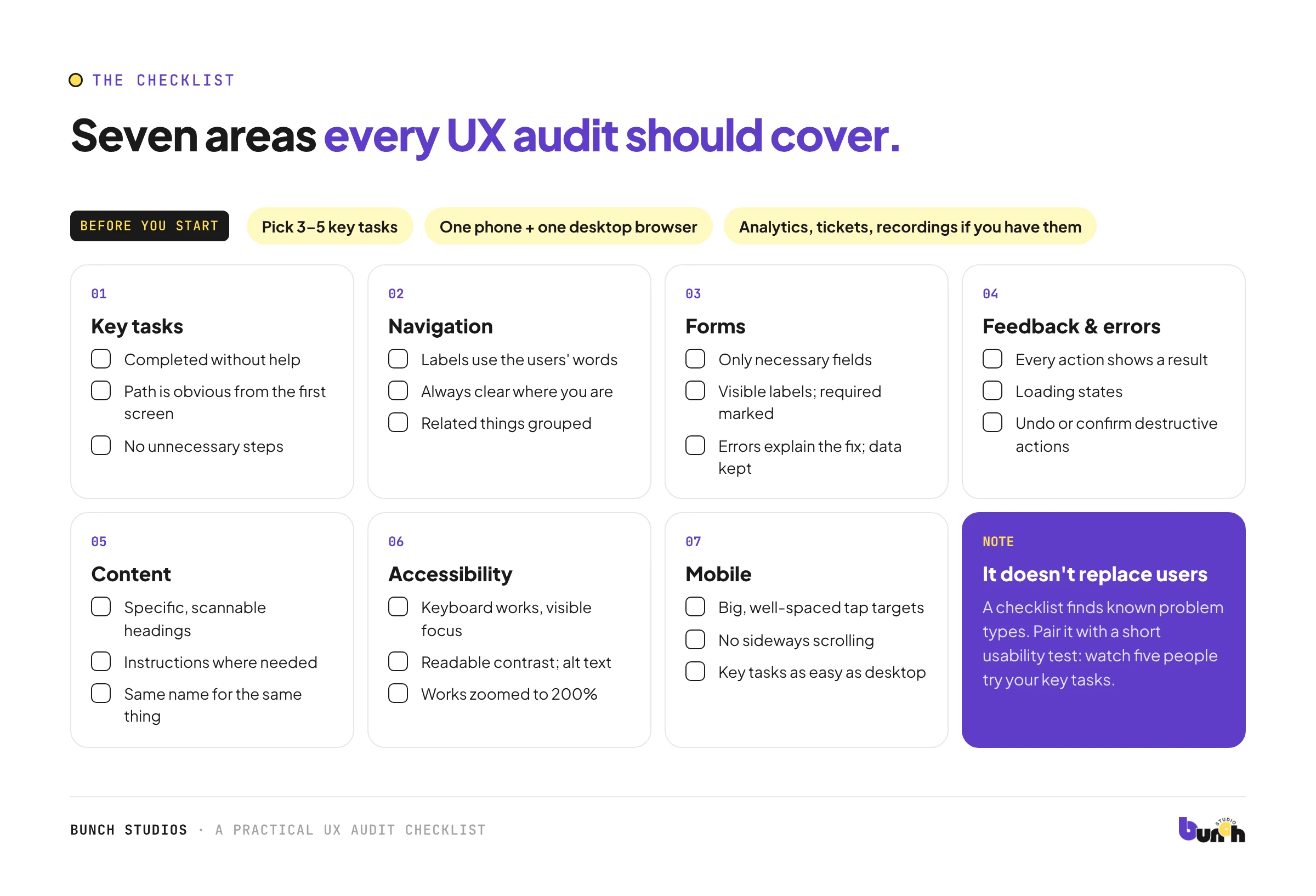
1. Key tasks
- Each key task can be completed without help.
- The path to each task is obvious from the first screen.
- There are no unnecessary steps.
2. Navigation and structure
- Menu labels use the users' words.
- Users can always tell where they are and how to go back.
- Related things are grouped together.
- Search (if present) finds what people type.
3. Forms
- Only necessary fields are asked.
- Every field has a visible label.
- Required fields are clearly marked.
- Errors explain what's wrong and how to fix it, next to the field.
- Entered data isn't lost after an error.
4. Feedback and errors
- Every action shows a clear result (saved, sent, failed).
- Loading states show that something is happening.
- Destructive actions ask for confirmation or can be undone.
- Empty states explain what to do next.
5. Content
- Headings and labels are specific and scannable.
- Instructions appear where they're needed.
- Jargon is removed or explained.
- The same thing is called the same name everywhere.
6. Accessibility basics
- Everything works with a keyboard, with visible focus.
- Text contrast is readable.
- Images have suitable alt text.
- Content works when zoomed to 200%.
Accessibility has its own standard (WCAG, from the W3C), with levels A, AA and AAA (W3C). See our accessibility checklist for more detail.
7. Mobile
- Tap targets are big enough and well spaced.
- No sideways scrolling to read.
- Key tasks are as easy on a phone as on desktop.
Our mobile-friendly check has a timed version for websites.
Who should run it, and how often
Ideally, someone who didn't design or build the product, because fresh eyes catch what the team no longer notices. If that isn't possible, swap roles: the designer audits the flows they didn't work on. Run a full audit before a major redesign or launch, and a lighter check of the key tasks every few months, or after any big change to navigation, forms or onboarding.
How to score what you find
For each problem, rate:
- Impact: 1 = annoying, 2 = slows people down, 3 = blocks the task
- Frequency: 1 = rare screen, 2 = common, 3 = on a key task
Multiply the two. Fix the 9s and 6s first.
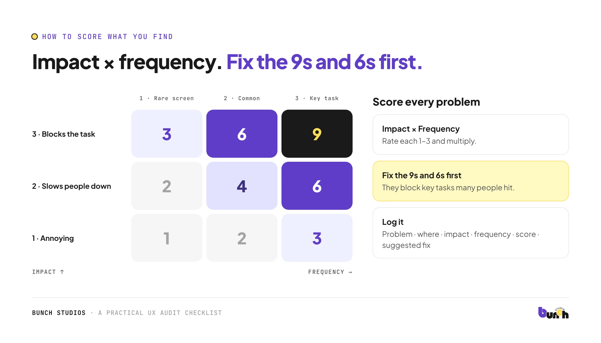
| Problem | Where | Impact | Frequency | Score | Suggested fix |
|---|
Turning findings into action
An audit is only useful if it changes something. Group related problems (for example, all form errors), give each group an owner, and fix the highest scores first. After each round of fixes, re-run the key tasks to confirm the problem is gone and nothing new broke. Keep the findings table; repeating the audit after a few months shows whether the product is getting easier to use. Share the top three findings with the whole team, not just designers: many fixes are copy or content changes anyone can make.
What this checklist can't tell you
A checklist finds known types of problems; it can't tell you what users expect or why they behave as they do. Pair it with a short usability test: watch five people attempt your key tasks. Our article on why users find apps confusing covers what to look for.
How Bunch Studios can help
Bunch Studios' secondary practice is product, UI/UX and dashboard design. We can review key tasks on real devices, score the problems, and give you a prioritized fix list. You can act on it yourself or with us.
Discuss Your ProjectHow we made this guide: drafted with AI assistance and checked against the source linked above.
Sources: W3C WAI, WCAG 2 Overview, checked Oct 13, 2026