How to Make Your Website Easier to Navigate
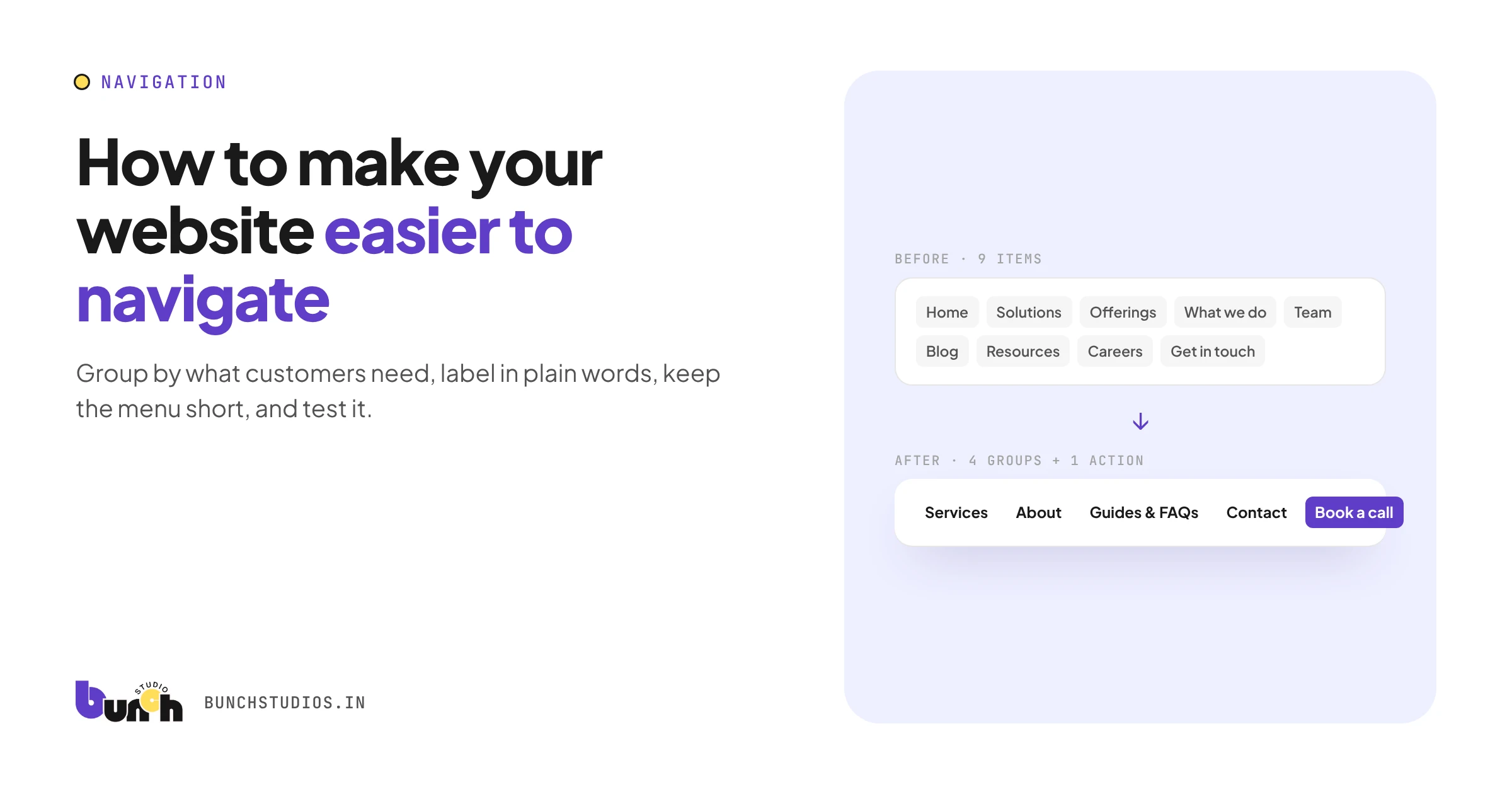
To make a small business website easier to navigate: group your pages the way customers think (by what they need, not how your business is organized), label menu items in plain words, keep the main menu short, and make sure every page points to a clear next step. Then test it: watch a few people try to find something specific, and fix where they hesitate. Most navigation problems come from too many choices or labels only insiders understand.
Six fixes, in order of impact
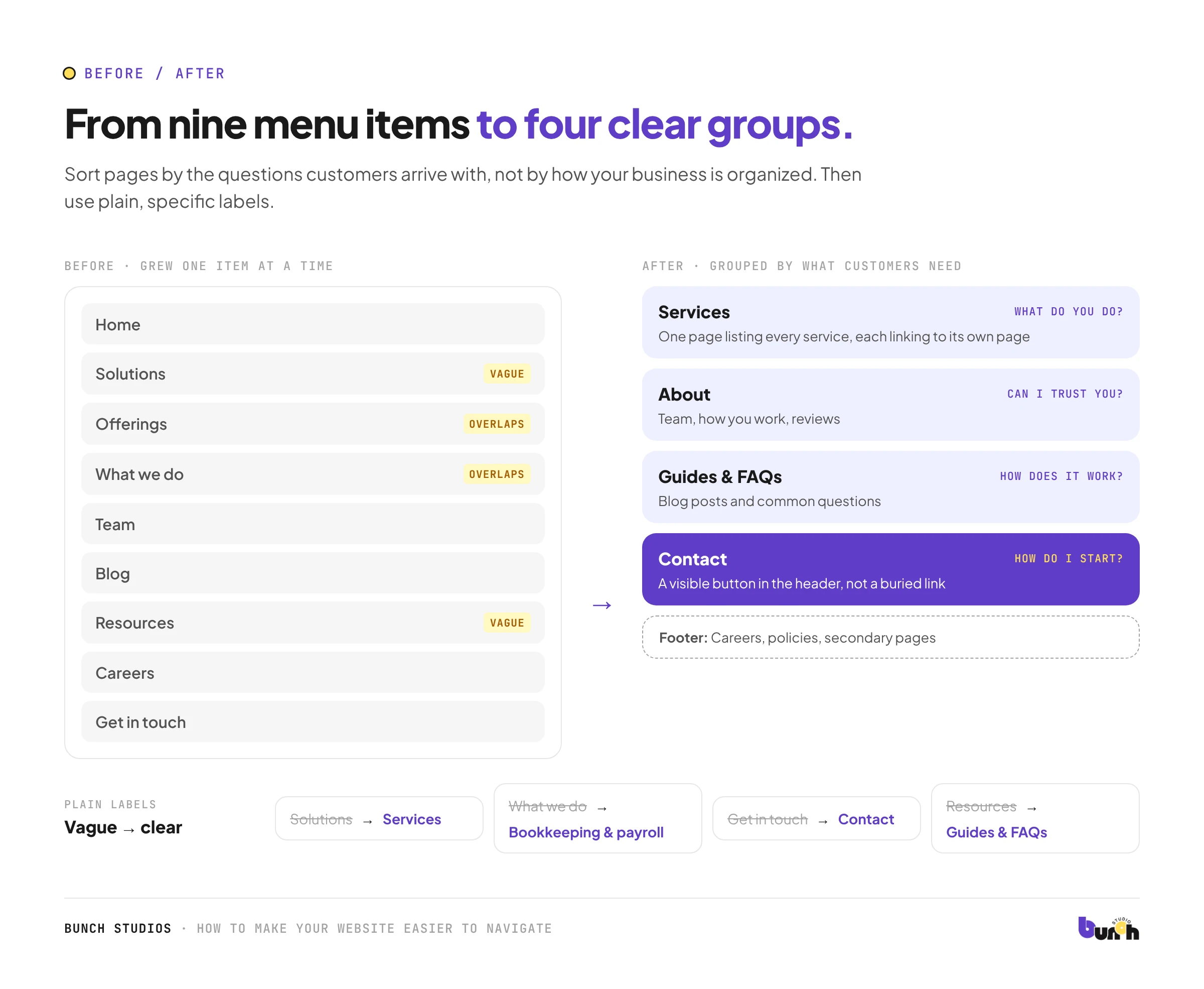
1. Group by what customers need
List every page, then sort them by the questions customers come with: What do you do? Is it for me? How does it work? Can I trust you? How do I start? Most small business sites end up with four or five groups: Services, About, maybe Work or Reviews, Resources, Contact.
2. Use plain, specific labels
A label should tell people what they'll find before they click.
| Vague | Clear |
|---|---|
| Solutions | Services |
| What we do | Bookkeeping & payroll |
| Get in touch | Contact |
| Resources | Guides & FAQs |
3. Keep the main menu short
Every extra item makes the others harder to find. Keep the main menu to the few things most visitors need, and move the rest to a footer or a section page. If you have many services, link to one Services page that lists them clearly, rather than a long dropdown.
4. Put the main action in the menu
If you want people to call, book or request a quote, make that a visible button in the header, not just a page buried in a list.
5. Design every page's next step
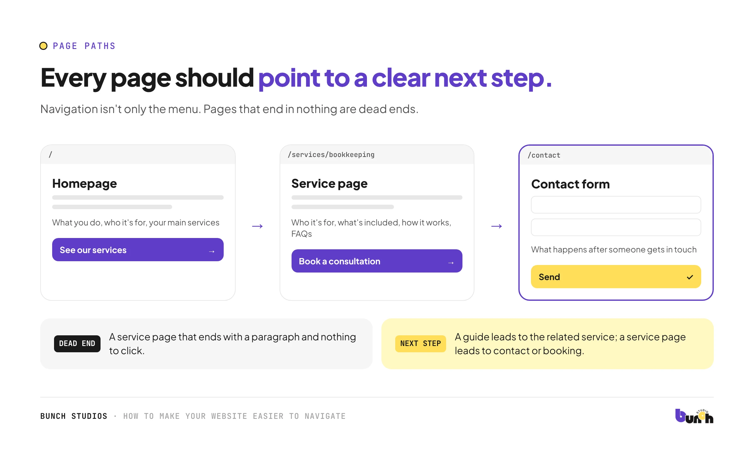
Navigation isn't only the menu. Each page should end with an obvious next move: a service page leads to contact or booking, a guide leads to the related service. Pages that end in nothing are dead ends.
6. Make it work on phones
- The menu button should be easy to find and tap.
- Phone number and main action should be reachable without opening the menu.
- Dropdowns inside the mobile menu should be simple to open and close.
See our mobile-friendly website check for more.
Test it with five people (it takes an hour)
You don't need a lab. Ask a few people who don't know your business well:
- Give each one a task: "Find out whether they work in your area," "Find the price approach," "Book a consultation."
- Watch, without helping. Note where they hesitate or click the wrong thing.
- Fix the biggest problem, then test again.
This is an informal check, not formal research, but it reliably shows the worst problems.
Use your own data
Your analytics can point to navigation problems too. Look for pages people reach often but leave quickly, menu items almost nobody clicks, and site searches for things that are already on your site. Each one is a clue about a label, a group or a missing link. Change one thing at a time so you can see what helped.
Don't forget the less visible parts
- Search: useful only on larger sites. A small site with clear navigation usually doesn't need one.
- Footer: a good home for secondary pages (policies, careers, FAQs).
- Keyboard and screen readers: menus should work without a mouse. See our accessibility checklist.
- Consistent placement: keep the menu in the same place on every page.
How Bunch Studios helps
In a redesign, we review how your current site is organized, group pages around what your customers need, and rebuild the navigation and page paths so the next step is always obvious, on phones as well as desktop.
Request a Scoped EstimateHow we made this guide: drafted with AI assistance.